DateRangePicker
Examples#
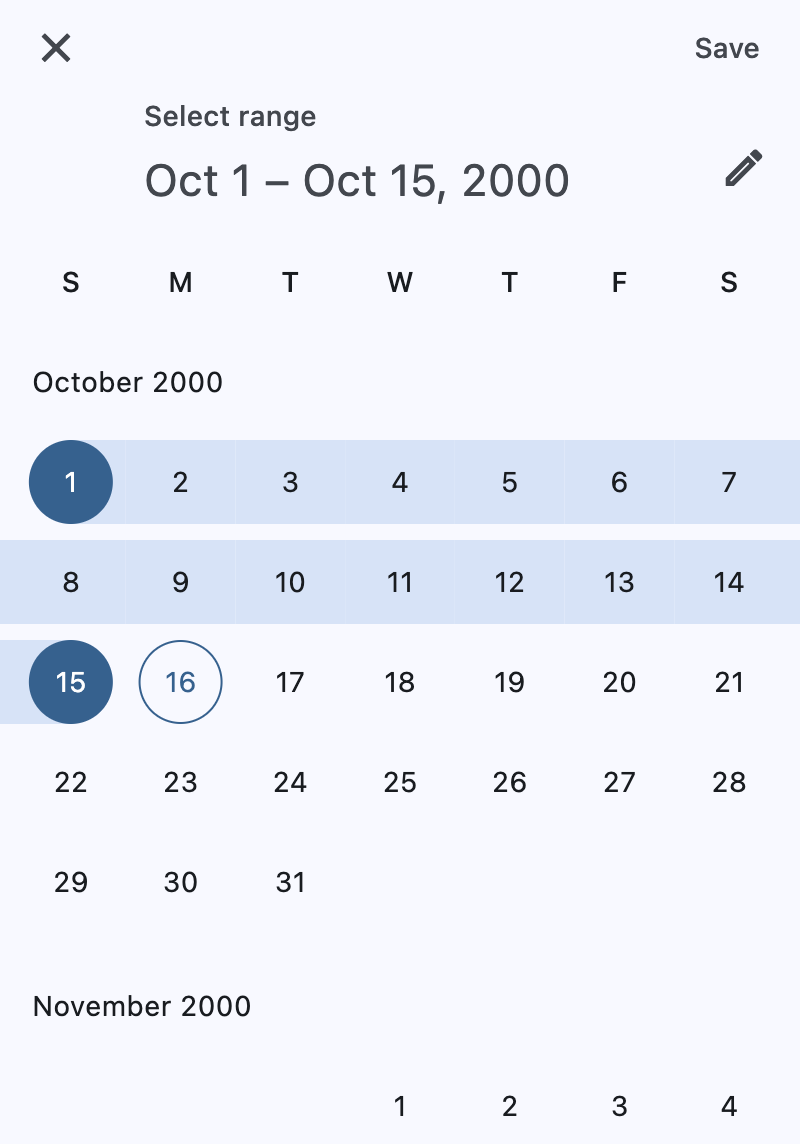
Basic Example#
import datetime

import flet as ft


def main(page: ft.Page):
    page.horizontal_alignment = ft.CrossAxisAlignment.CENTER

    def handle_change(e):
        page.add(
            ft.Text(
                f"Start Date changed: {e.control.start_value.strftime('%m/%d/%Y')}"
            ),
            ft.Text(f"End Date changed: {e.control.end_value.strftime('%m/%d/%Y')}"),
        )

    def handle_dismissal(e):
        page.add(ft.Text("DatePicker dismissed"))

    page.add(
        ft.Button(
            content=ft.Text("Pick date"),
            icon=ft.Icons.PHONE,
            on_click=lambda e: page.show_dialog(
                ft.DateRangePicker(
                    start_value=datetime.datetime(year=2000, month=10, day=1),
                    end_value=datetime.datetime(year=2000, month=10, day=15),
                    on_change=handle_change,
                    on_dismiss=handle_dismissal,
                )
            ),
        )
    )


ft.run(main)
Bases: DialogControl
A Material-style date range picker dialog.
It can be opened by calling Page.show_dialog() method.
Depending on the date_picker_entry_mode, it will show either a Calendar
or an Input (TextField) for picking a date range.
adaptive: bool | None = None
Enables platform-specific rendering or inheritance of adaptiveness from parent controls.
barrier_color: ColorValue | None = None
The color of the modal barrier that darkens everything below the date picker.
If None, the DialogTheme.barrier_color
is used.
If it is also None, then Colors.BLACK_54 is used.
col: ResponsiveNumber = 12
If a parent of this control is a ResponsiveRow,
this property is used to determine
how many virtual columns of a screen this control will span.
Can be a number or a dictionary configured to have a different value for specific
breakpoints, for example col={"sm": 6}.
This control spans the 12 virtual columns by default.
Dimensions
| Breakpoint | Dimension |
|---|---|
| xs | <576px |
| sm | ≥576px |
| md | ≥768px |
| lg | ≥992px |
| xl | ≥1200px |
| xxl | ≥1400px |
current_date: DateTimeValue = field(
    default_factory=lambda: now()
)
The date representing today. It will be highlighted in the day grid.
date_picker_entry_mode: DatePickerEntryMode = CALENDAR
The initial mode of date entry method for the date picker dialog.
disabled: bool = False
Every control has disabled property which is False by default - control and all
its children are enabled.
Note
The value of this property will be propagated down to all children controls recursively.
end_value: DateTimeValue | None = None
The selected end date that the picker should display.
Defaults to current_date.
error_format_text: str | None = None
The error message displayed below the TextField if the entered date is not in the correct format.
error_invalid_range_text: str | None = None
The message used when the date range is invalid (e.g. start date is after end date).
error_invalid_text: str | None = None
The error message displayed below the TextField if the date is earlier than
first_date or later than last_date.
expand_loose: bool = False
Allows the control to expand along the main axis if space is available, but does not require it to fill all available space.
More information here.
field_end_hint_text: str | None = None
The text used to prompt the user when no text has been entered in the end field.
field_end_label_text: str | None = None
The label for the end date text input field.
field_start_hint_text: str | None = None
The text used to prompt the user when no text has been entered in the start field.
field_start_label_text: str | None = None
The label for the start date text input field.
first_date: DateTimeValue = field(
    default_factory=lambda: datetime(
        year=1900, month=1, day=1
    )
)
The earliest allowable date on the date range. Defaults to January 1, 1900.
help_text: str | None = None
The text that is displayed at the top of the header.
This is used to indicate to the user what they are selecting a date for.
keyboard_type: KeyboardType = DATETIME
The type of keyboard to use for editing the text.
last_date: DateTimeValue = field(
    default_factory=lambda: datetime(
        year=2050, month=1, day=1
    )
)
The latest allowable date on the date range. Defaults to January 1, 2050.
modal: bool = False
Whether this date picker cannot be dismissed by clicking the area outside of it.
on_change: ControlEventHandler[DateRangePicker] | None = (
    None
)
Called when user clicks confirm button.
value is updated with selected date.
The data property of the event handler argument contains the selected date.
on_dismiss: ControlEventHandler[DialogControl] | None = None
Called when dialog is dismissed.
opacity: Number = 1.0
Defines the transparency of the control.
Value ranges from 0.0 (completely transparent) to 1.0 (completely opaque
without any transparency).
parent: BaseControl | None
The direct ancestor(parent) of this control.
It defaults to None and will only have a value when this control is mounted
(added to the page tree).
The Page control (which is the root of the tree) is an exception - it always
has parent=None.
save_text: str | None = None
The label on the save button for the fullscreen calendar mode.
start_value: DateTimeValue | None = None
The selected start date that the picker should display.
Defaults to current_date.
switch_to_calendar_icon: IconData | None = None
The name of the icon displayed in the corner of the dialog when
date_picker_entry_mode
is DatePickerEntryMode.INPUT.
Clicking on this icon changes the date_picker_entry_mode to
DatePickerEntryMode.CALENDAR.
If None, Icons.CALENDAR_TODAY is used.
switch_to_input_icon: IconData | None = None
The name of the icon displayed in the corner of the dialog when
date_picker_entry_mode
is DatePickerEntryMode.CALENDAR.
Clicking on icon changes the DatePickerEntryMode to
DatePickerEntryMode.INPUT.
If None, Icons.EDIT_OUTLINED is used.
tooltip: TooltipValue | None = None
The tooltip ot show when this control is hovered over.
visible: bool = True
Every control has visible property which is True by default - control is
rendered on the page. Setting visible to False completely prevents control (and
all its children if any) from rendering on a page canvas. Hidden controls cannot be
focused or selected with a keyboard or mouse and they do not emit any events.
Called once during control initialization to define its child controls. self.page is available in this method.